Everyone is talking about big DIX (Dark Index TM).
DIX recently printed ~51%, the second biggest DIX observation in the public data-set. The SqueezeMetrics original paper shows SPX forward returns from >45% DIX to be around 5% on average on a 60 day forward time-frame. The paper does not explore the relationship between day 1 and day 59 – which we think could provide additional context on the meaning of DIX at any given size. As such…
In this post we investigate returns between day 1 and day 59. This allows us to capture the non-parametric spectrum of SPX returns that all DIX sizes have previously yielded.
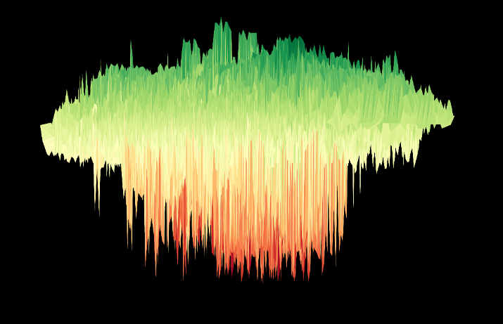
We will conduct the analysis by exploring the multitude of distributions contained in the cloud of DIX. In particular we will focus on the risk associated with high DIX levels. The cloud of DIX is shown below:
Cloud of DIX

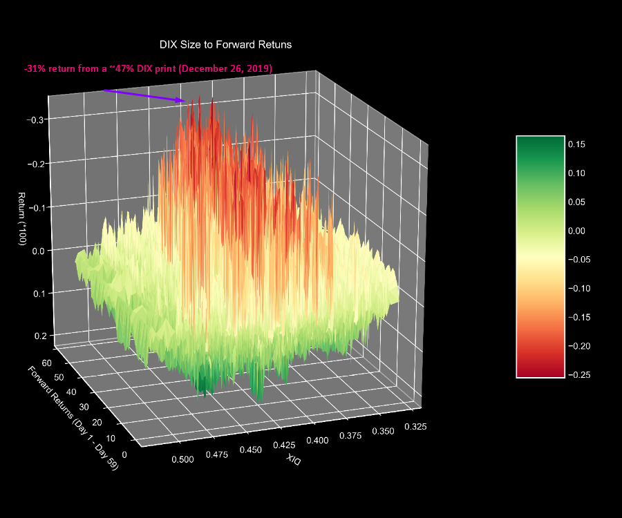
The cloud of DIX has 3 axes.
- The X Axis is the SPX Forward Return time period from days 1 to 59.
- The Y Axis is the size of DIX, on any given day.
- The Z Axis is the SPX Forward Return given the size of DIX and given the respective forward time period (between 1 and 59 days).
Green colors on the cloud represent positive forward returns on any given time-frame given the level of DIX, while red colors represent negative forward returns on any given time-frame given the level of DIX.
The (short) video below shows various angles of the DIX cloud, starting with a normal cloud (first image shown in this post), and ending with and inverted cloud. The video will also provide context on the cloud of DIX axes.
DIX Angles
By inverting the cloud, we get a good sense of the risk we face on any given time-frame. In particular, we want to know what kind of draw downs we can expect after big DIX prints.
Traversing through the cloud of DIX when DIX > 45%, we find the following: The largest draw down from DIX > 45% came at a level of DIX 46.9%, which printed on December 26, 2019. This is the worst draw down among all DIX sizes, which have historically spanned from about 33% to 51%.
Inverted Cloud of DIX

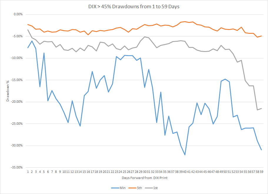
The table below shows SPX draw downs given a DIX over 45% at the 5th and 1st percentile and minimum. You can see the worst draw-downs occur in the two week time-frame (10 days), again in the 8 week time frame (40 days), and then finally again in the 10 week time-frame (60 days).
DIX Drawdowns
 45%” width=”707″ height=”512″>
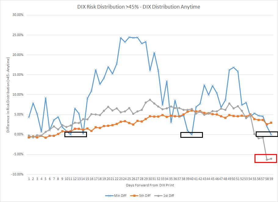
Like the price of an asset, risk is relative to the larger distribution. As such, we present in the following chart, the difference of draw-downs at the 5th (orange), 1st (grey) and minimum (blue) levels between DIX when it prints >45% and DIX anytime.

The chart shows the minimum draw-down when DIX >45% outperforms the minimum anytime by between 10% on day 14ish and ~25% between days 22 and 27ish. Similarly, the DIX >45% outperforms the 5th by about 6% peaking out on day 40 and the 1st peaking out on day 30.
Relative to DIX draw-downs anytime, however, the DIX outperforms on a 5th, 1st and minimum basis on nearly every-time time-frame from forward day 1 to forward day 59.
The 1st and 5th diffs are rising until day 30, and day 40 respectively. The black boxes highlight where both minimums are equal, driven by the Wuhan Virus Crash.
Finally the red box denotes the 1st percentile diff being lower on days 58 and 59 given the smaller distribution of DIX >45% against DIX anytime.
In summary of this post, a big DIX like any other indicator is not risk-free – most recently indicated by the largest draw-down of about 31% on a 59 day time-frame.
The DIX has about 10 years of data, the most obvious question is, does an extra large DIX (>50%) hold up in a recession. We do not, and will not have that answer for another 57 trading days. Keeping that in mind, we do not think any indicator is more important than prudent risk management in these unprecedented times:

Thanks,
If this content above was useful, please take a look at www.tradewell.app to easily analyze this relationship in minutes.
If you enjoyed this post, follow us on twitter @tradewellapp and subscribe for email updates.
For other discussions on risk check out our VIX backwardation series here:

Do you have a GitHub page? I am especially interested in the API you are you using to get these metrics.
Thanks!
I do not have github. I used data from squeezemetrics homepage. Linked at the top of the article…. no API